Design
Clear surfaces, strong contrast and a reduced information hierarchy make the message quick to understand.
Inhalte werden vorbereitet.
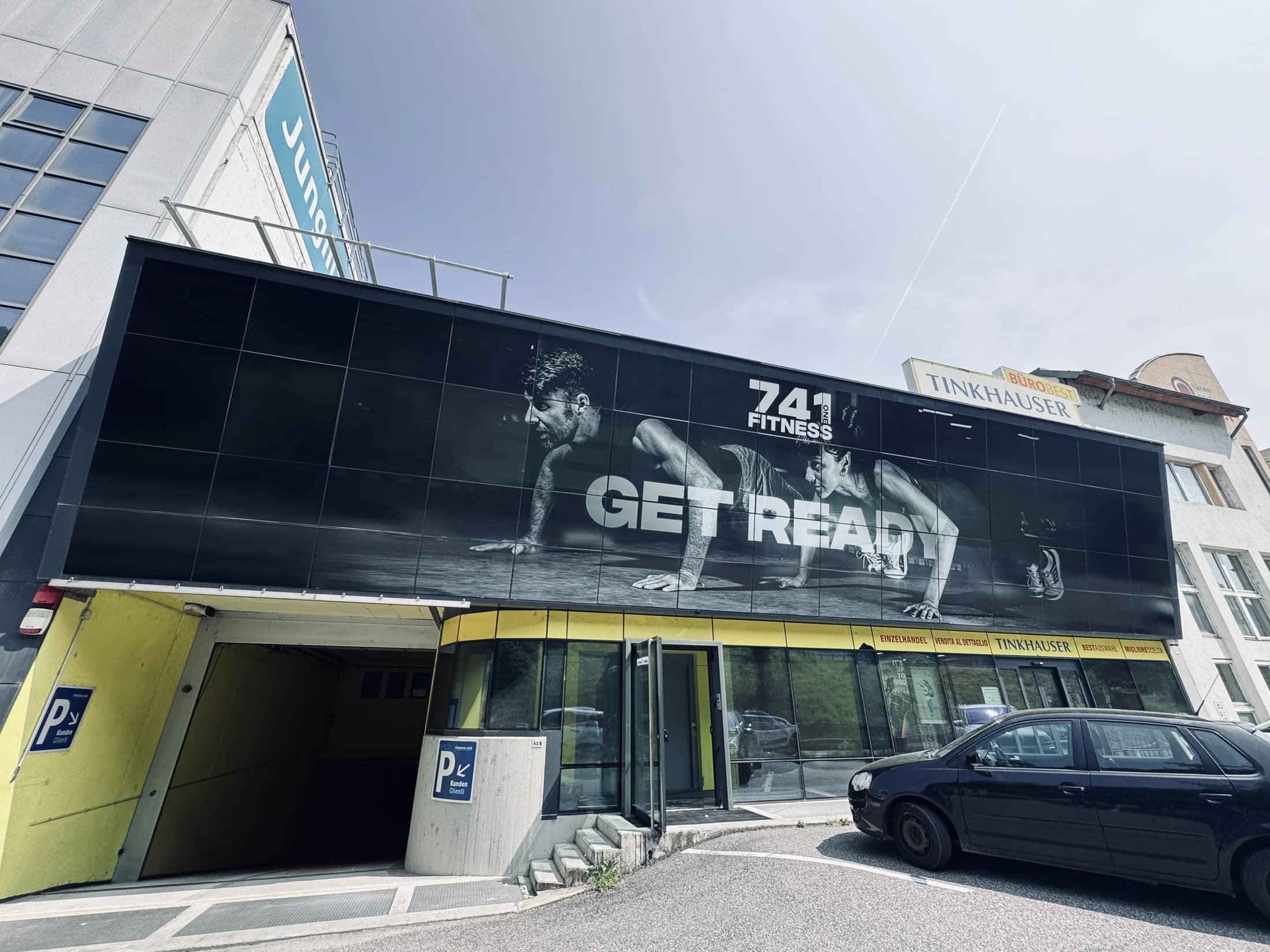
Before the project, it was difficult to tell that the building housed a gym. The windows conveyed too little information, the brand had almost no presence in the streetscape and the offer was not immediately clear.
1
Location
4
Concept elements
6
Project phases
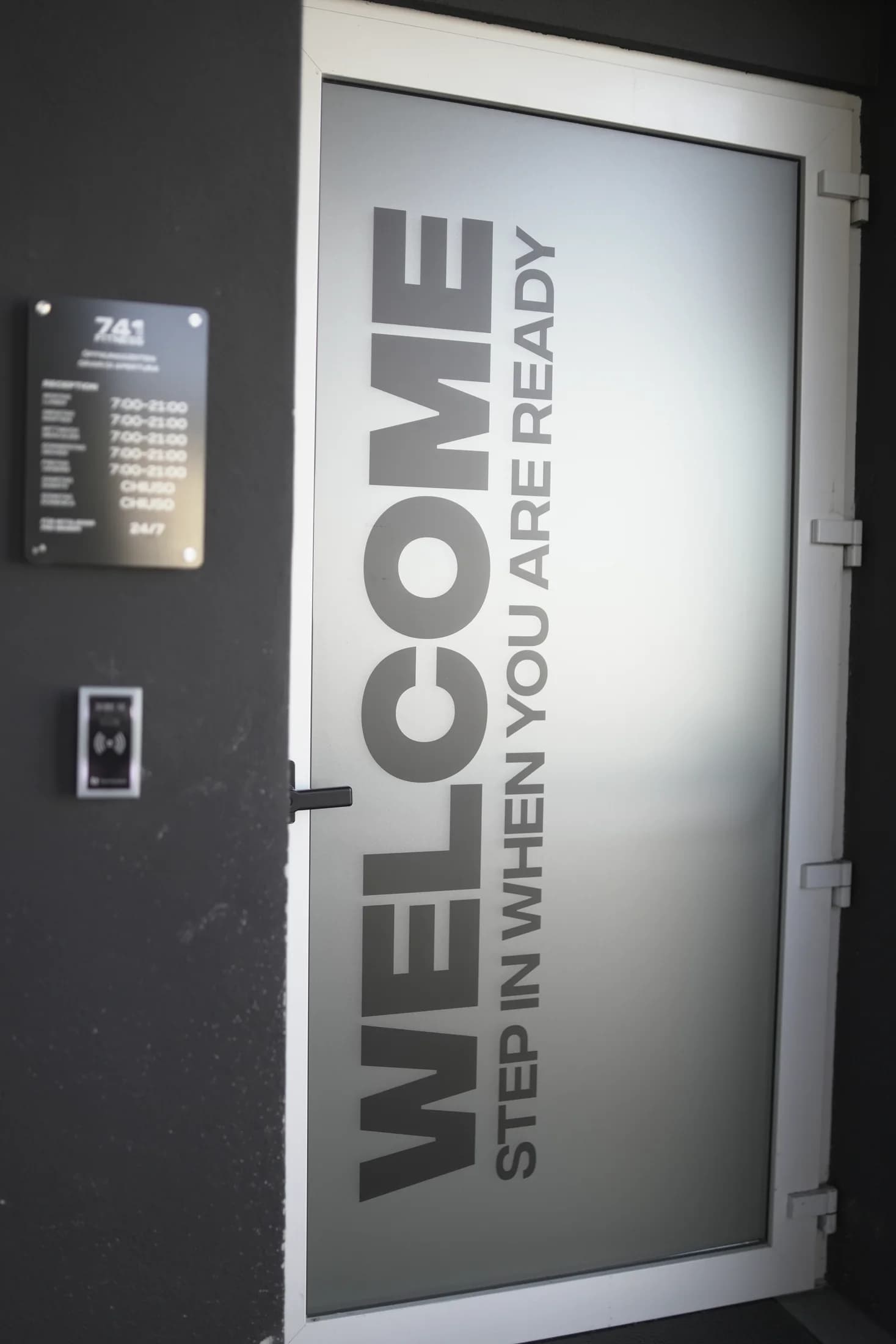
Because the graphics had to work from a distance, we developed a visually clear solution with strong recognition. The logo, brand colours and key messages were arranged for quick comprehension and to form one coherent image across the individual panes.
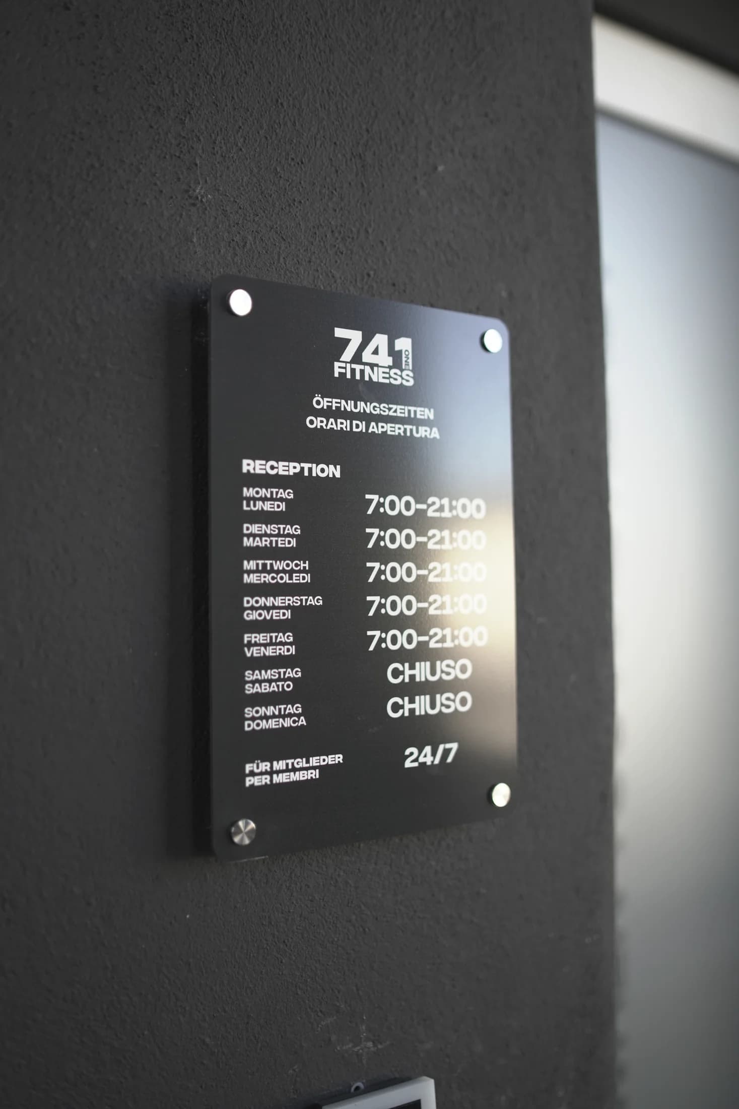
The finished graphics strengthen the location’s presence, convey the character of 741 Fitness and give passers-by clear orientation before they enter.
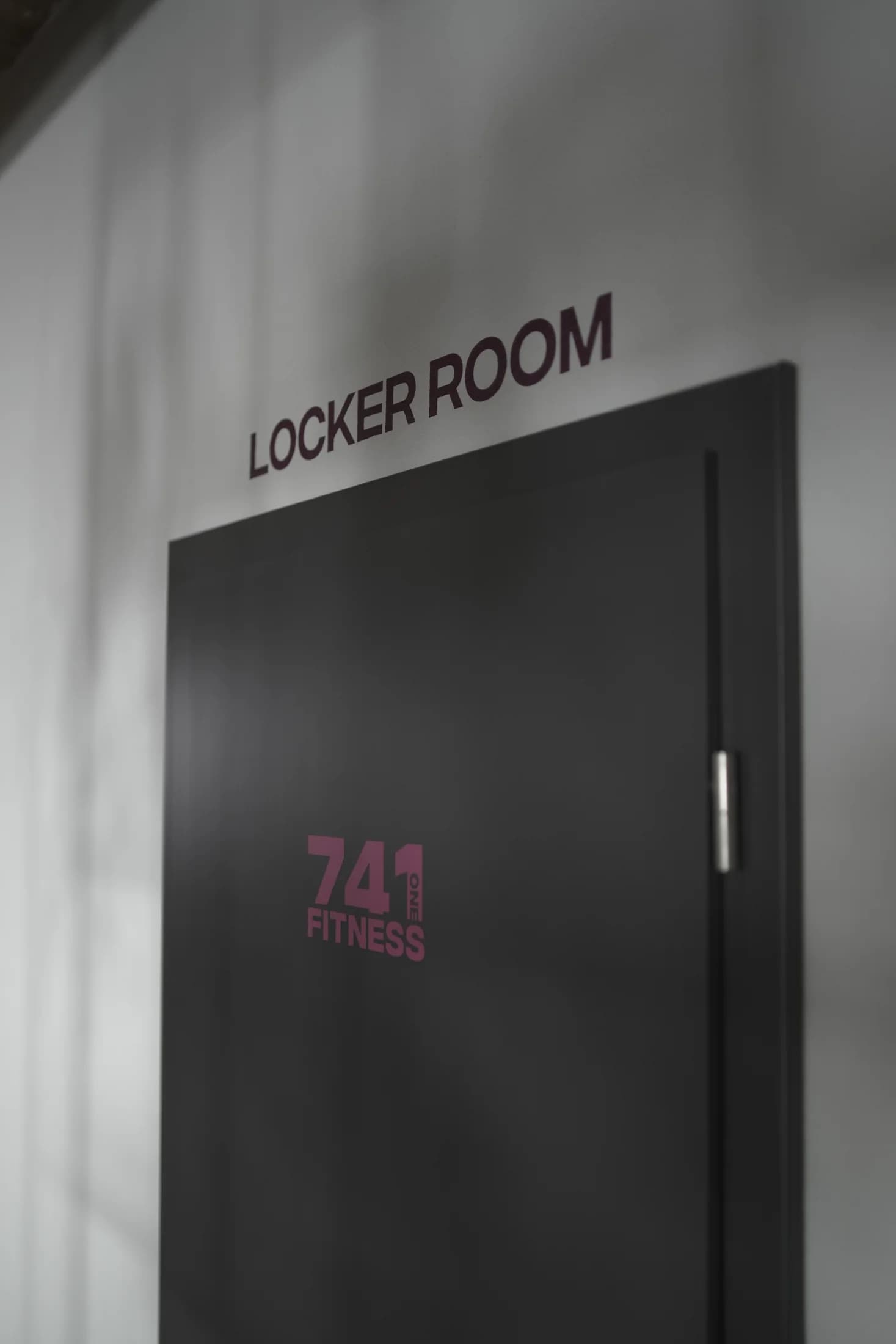
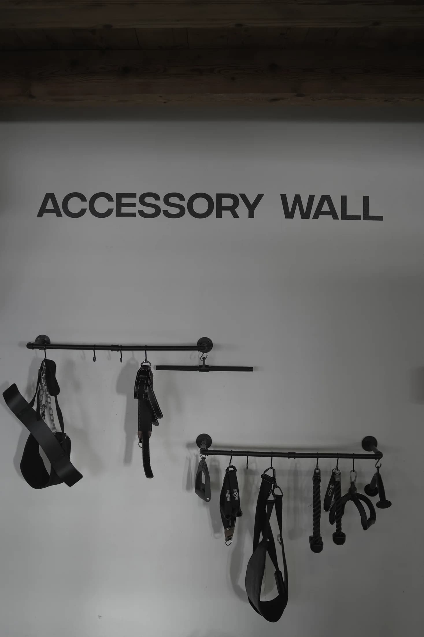
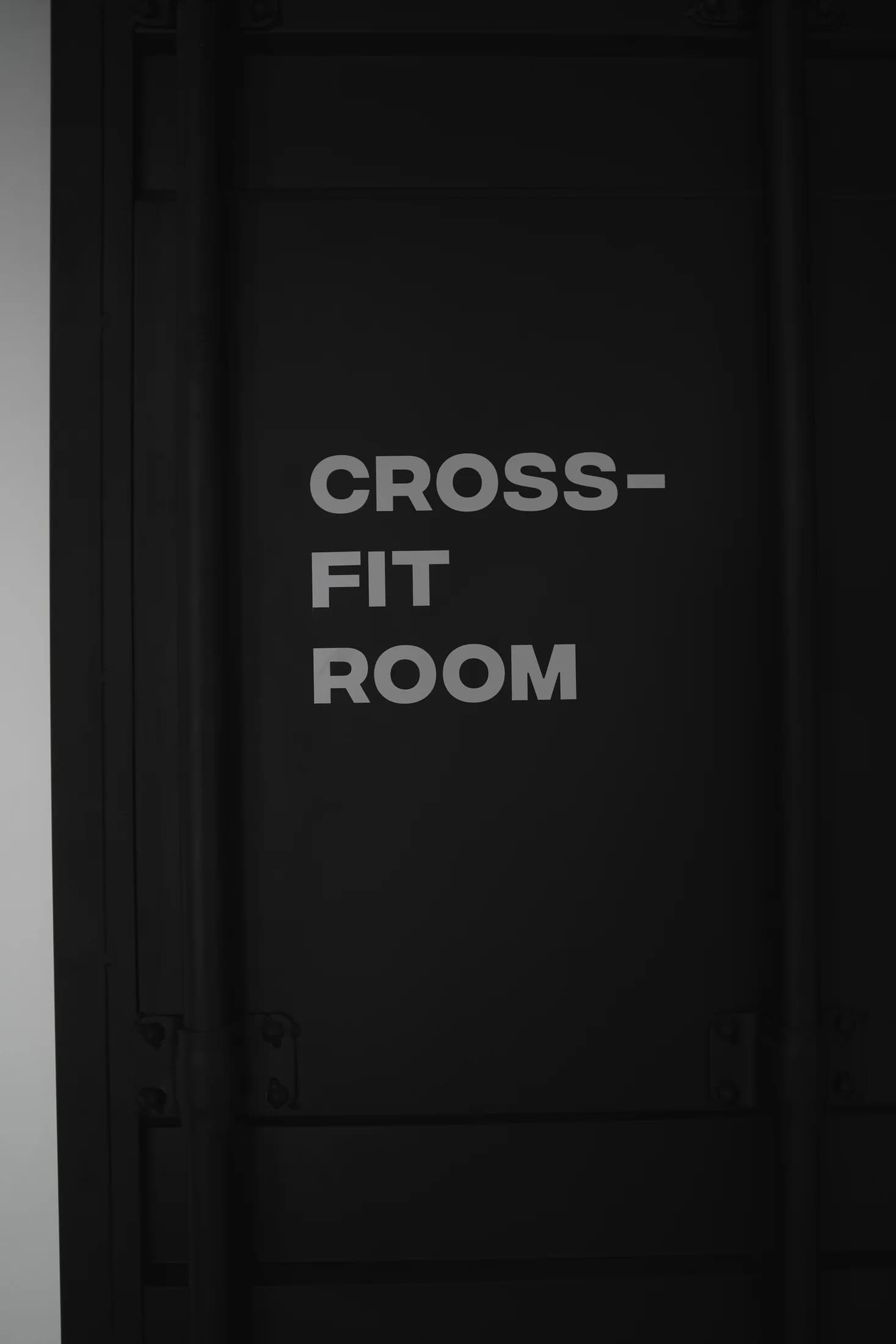
The project series shows the façade impact and complementary interior graphics. Together, the images reveal the consistent wayfinding system.
The exact material specification remains open in the project documentation and has deliberately not been filled in speculatively.
Clear surfaces, strong contrast and a reduced information hierarchy make the message quick to understand.
The artwork was precisely segmented so every element could be produced separately and installed in the correct order.
The films were positioned and applied precisely to create one coherent appearance.
Analysis of the location, sight lines, window divisions and customer requirements.
Together we develop graphics that fit your business, work from a distance and are professionally delivered.